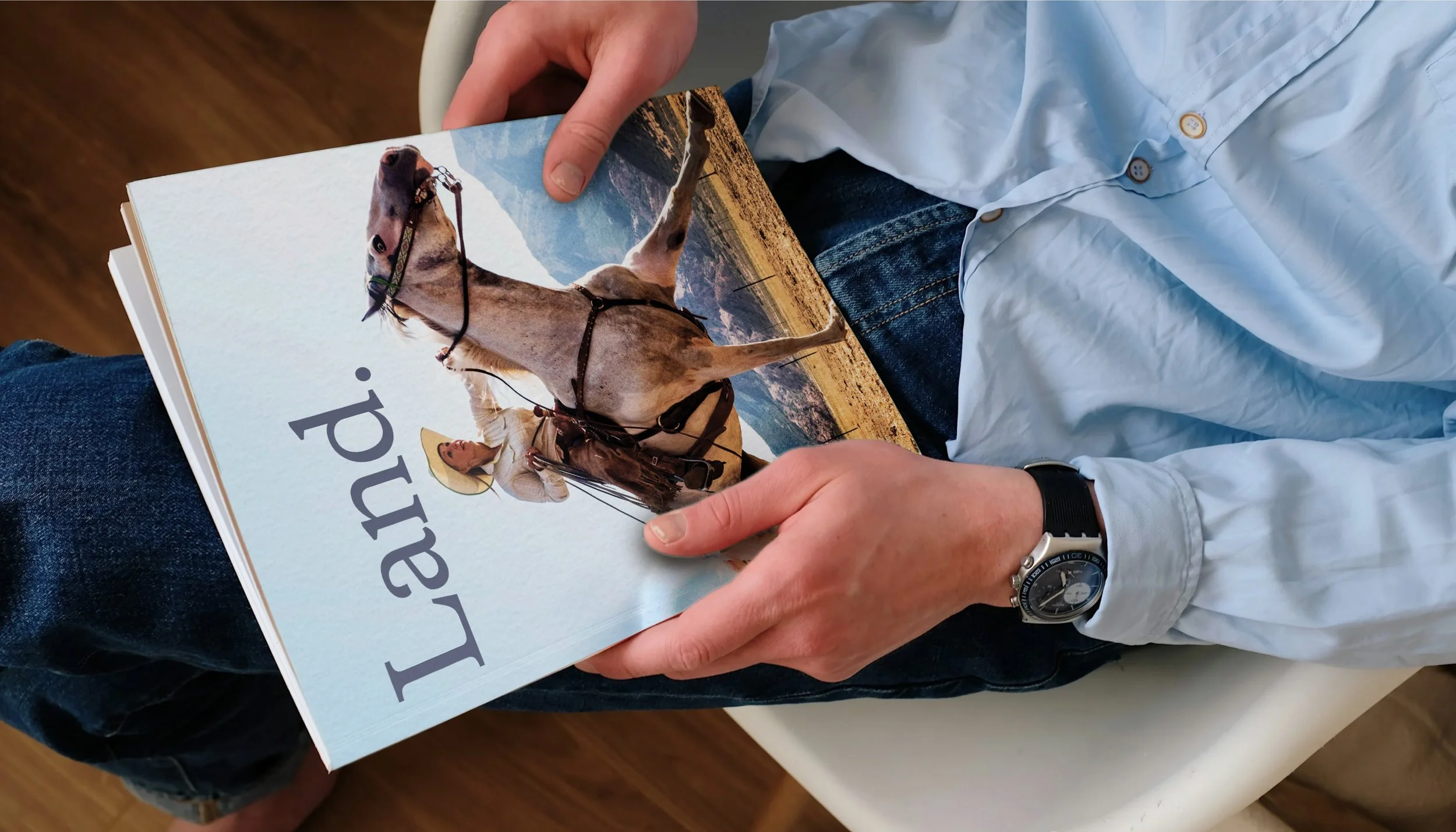
Brand Identity & Publication Design
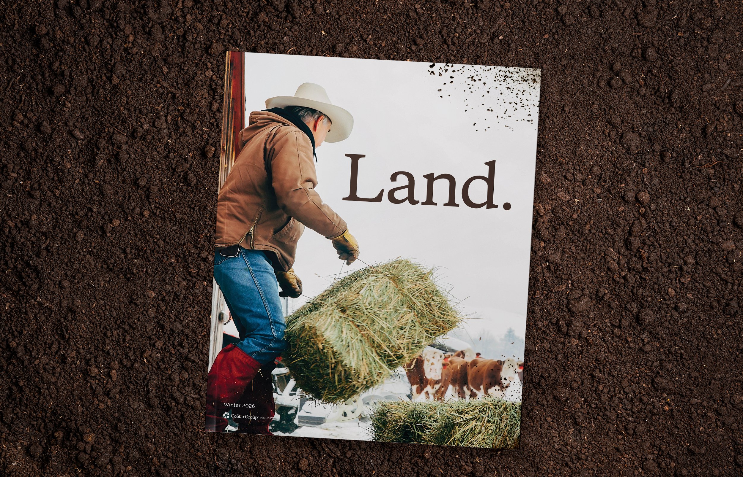
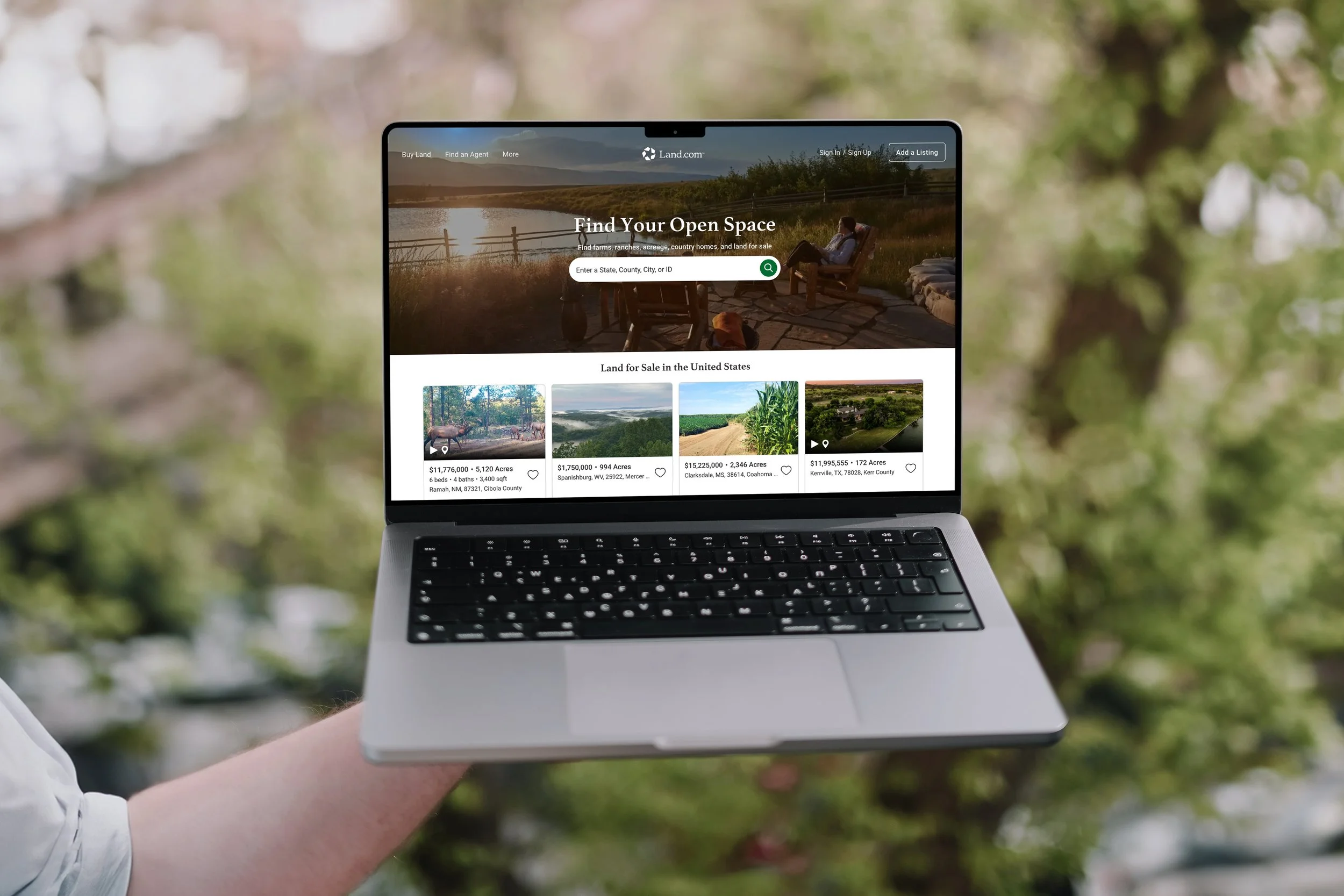
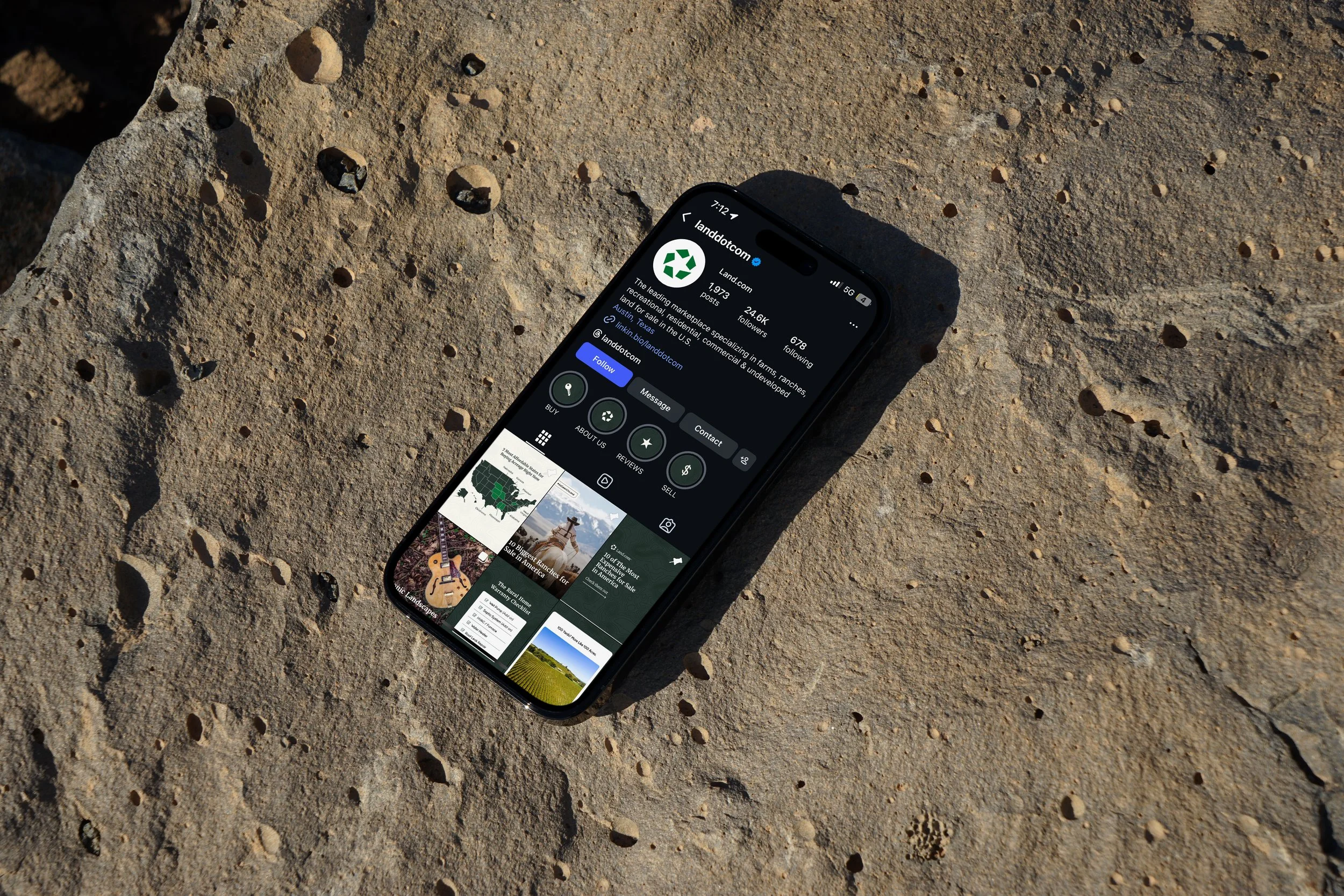
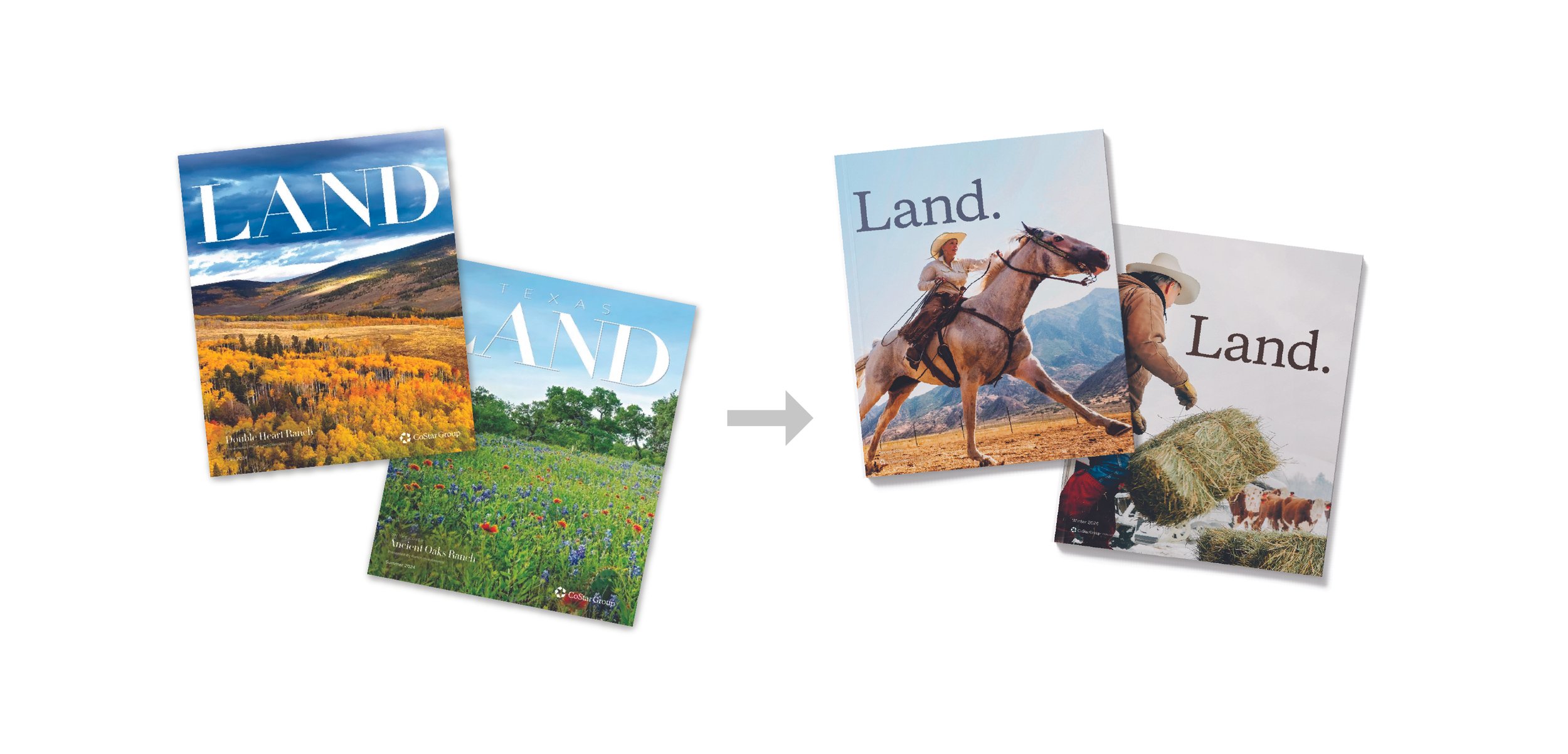
This project involved rebranding Land. magazine to create a stronger visual and strategic connection between the publication and its parent platform, Land.com. The goal was to unify the brand ecosystem while elevating the magazine's position as the premier publication for rural property enthusiasts, landowners, and prospective buyers.
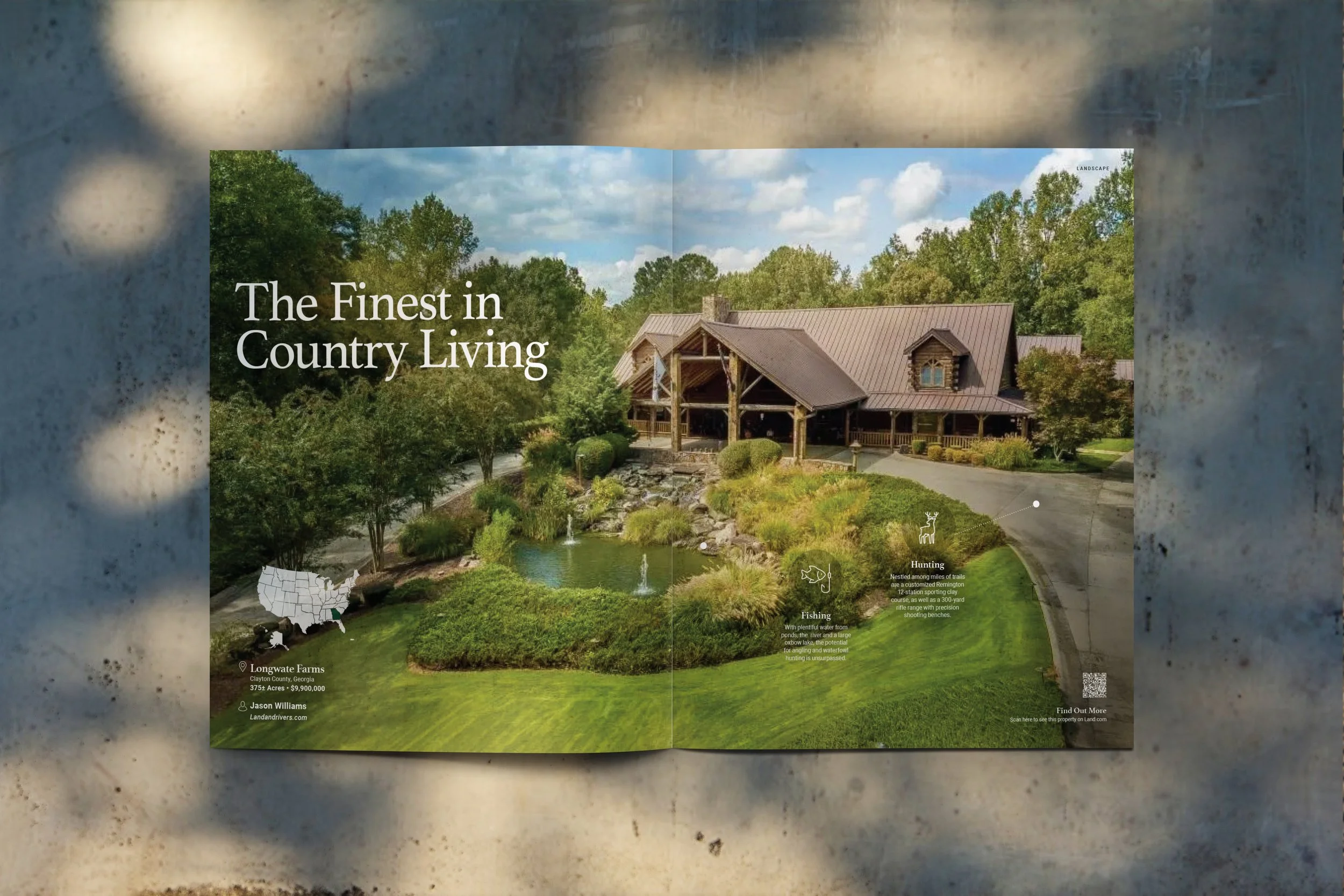
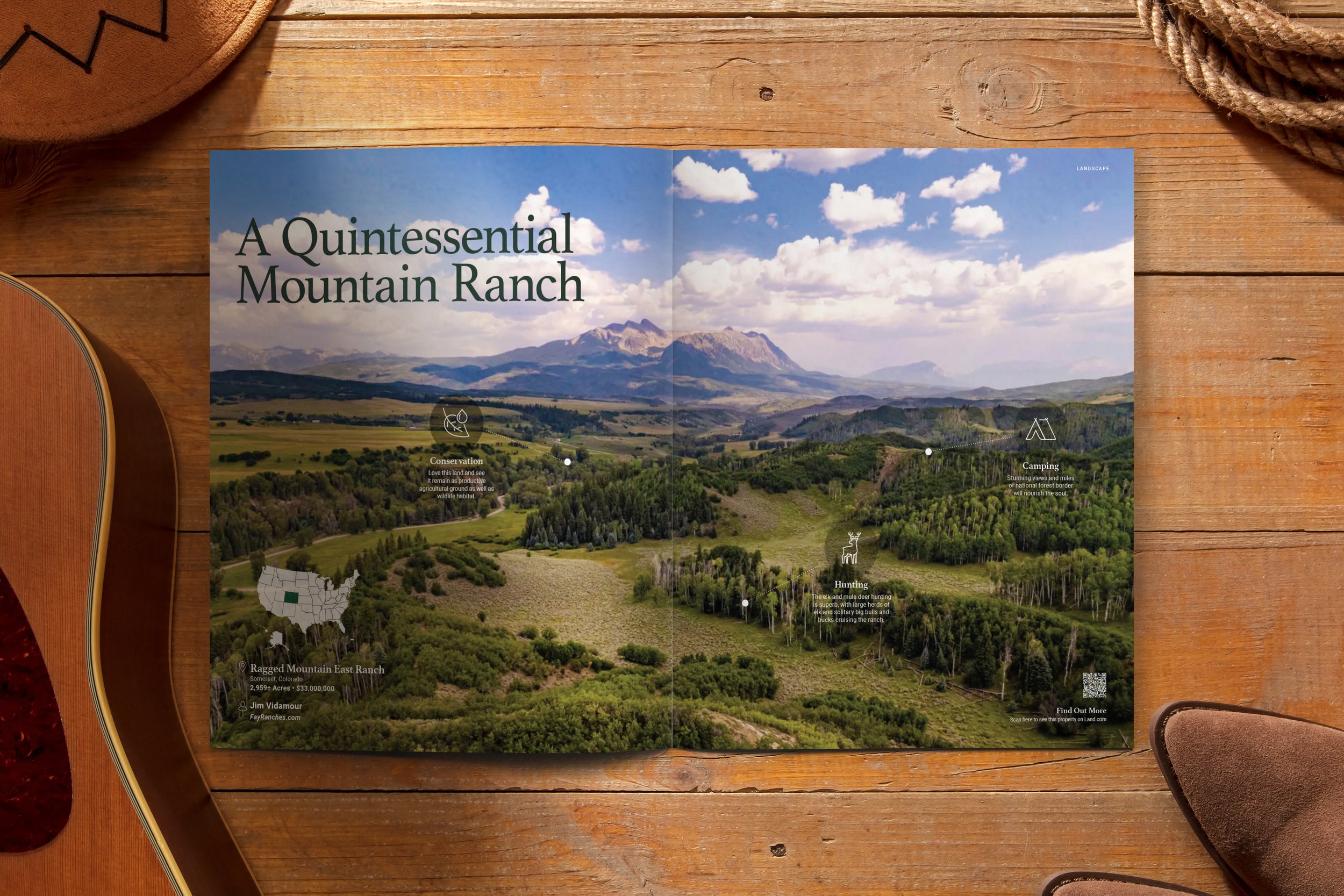
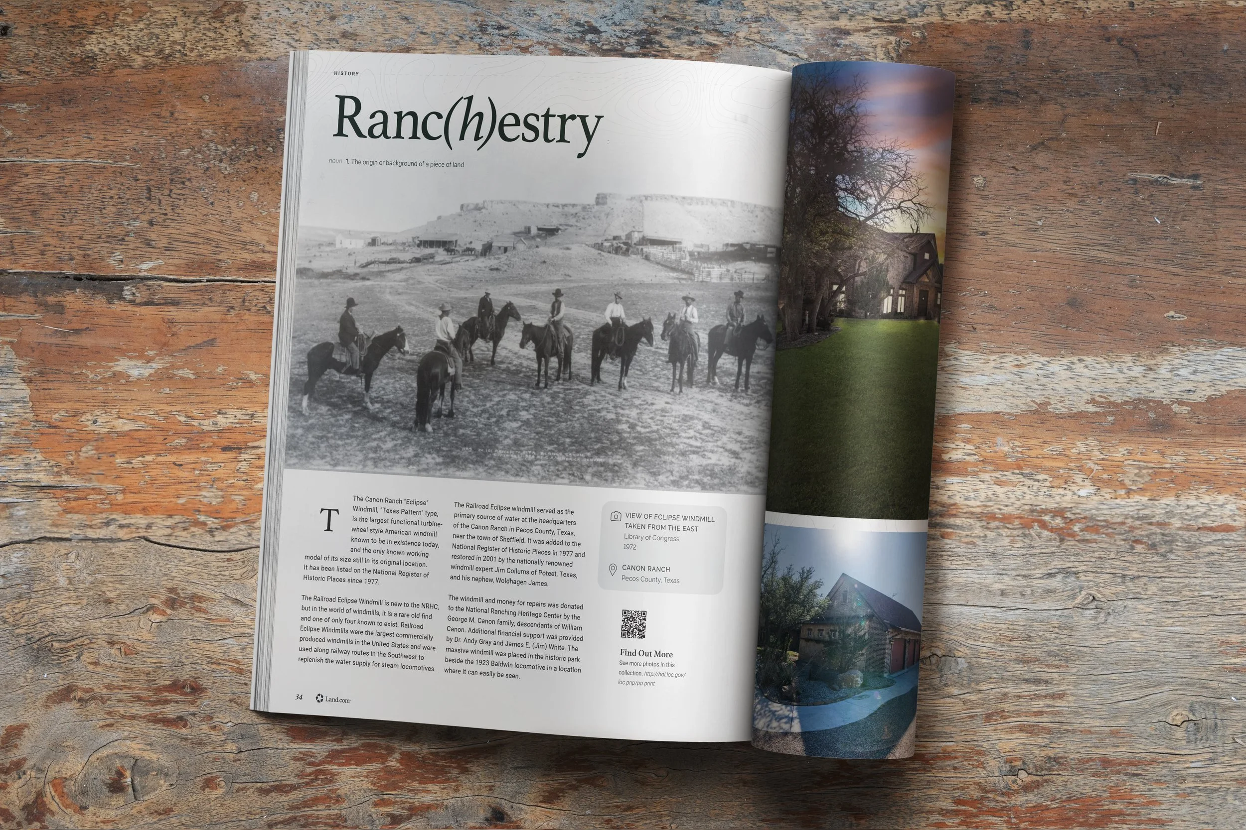
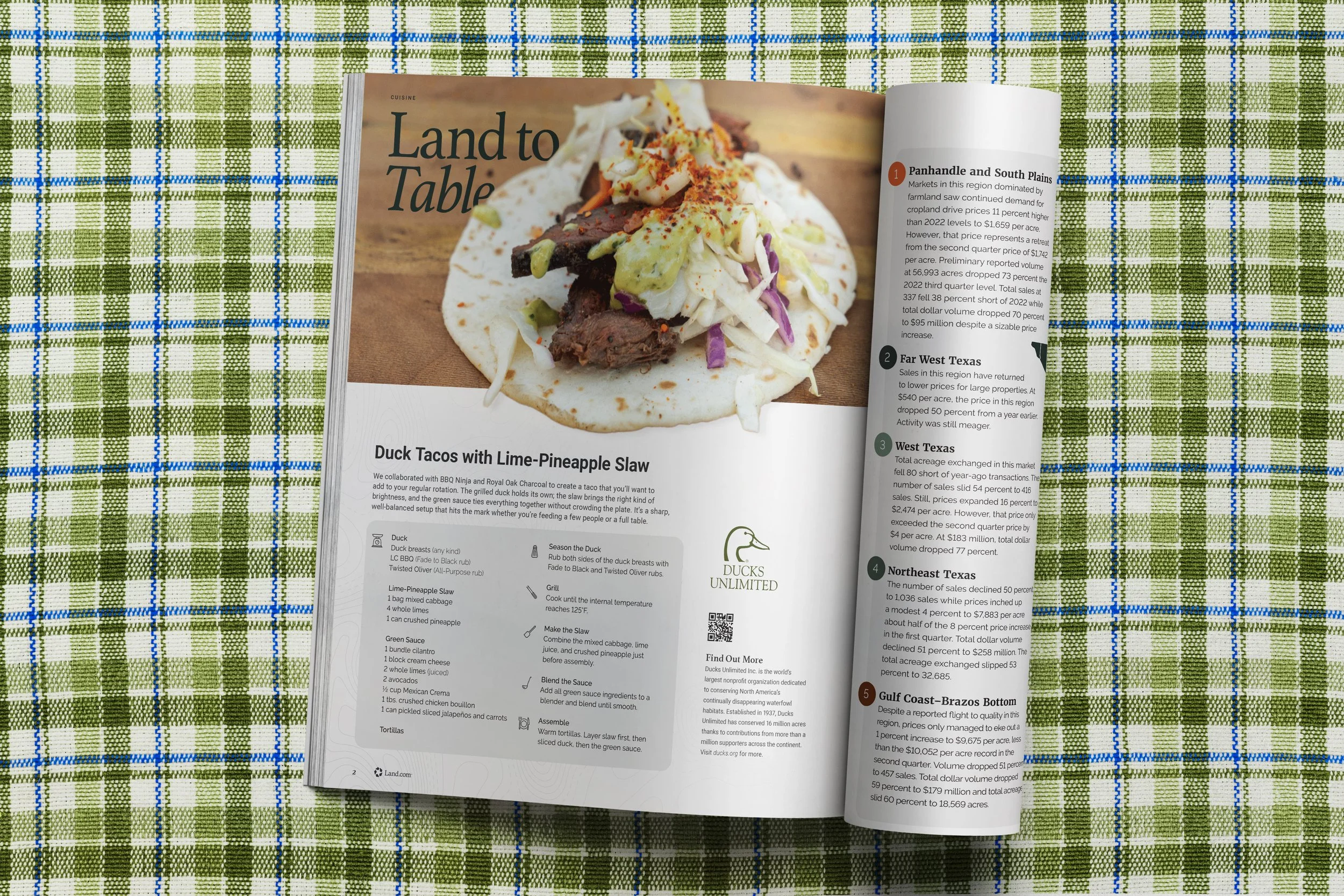
The refreshed identity balances sophistication with authenticity, reflecting the unique lifestyle surrounding rural land ownership. The design system was developed to support both high-end property listings and editorial content, creating a seamless experience that blends real estate, outdoor living, conservation, recreation, and rural culture.
Through updated logotype and masthead, refined layouts, and a cohesive visual language, the rebrand establishes Land. as a modern, upscale publication that showcases exceptional properties while celebrating the lifestyle and stories connected to the land itself. The stronger relationship between the magazine and Land.com, helps readers move effortlessly between mediums, resulting in a better user experience while discovering property.